CSS Boxes, Lists, Tables, and Forms
The Box Model
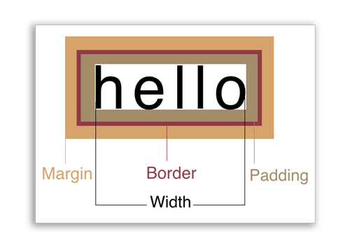
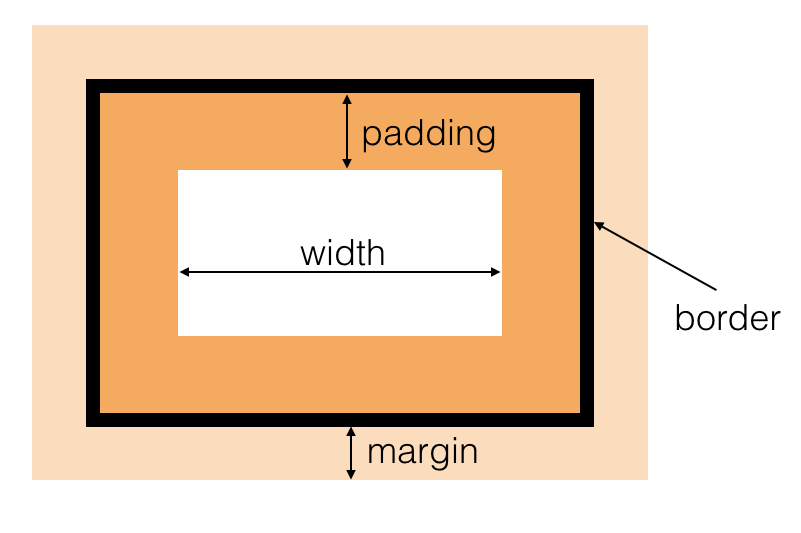
The CSS box model is a series of rules governing how boxes should work on the web. This includes four central properties:
- width/height — The dimensions of the inside of a box.
- padding — The space between the content and the box’s edges.
- margin — The space between the box and other elements around it.
- border — An area surrounding the box, usually visible as a line of a certain thickness.
It’s important to note that the width and height properties are counter-intuitive. They only determine the size of the area inside the box. This can be confusing when you have borders around the box, because the size of a box from border to border is determined by the width/height in addition to the padding.
Box Rules
There are a few rules governing how boxes react by default. Some of these can be counter-intuitive and really confuse people who are trying to imagine web page layout as a free-form process. It takes careful consideration of how to create designs as you conceive them in your head or from a mock-up. It’s a bit like putting together a puzzle.
- By default a box will have a width of “auto”, or the full width of its container. This means any block-level element you create will automatically stretch the full width of the browser, or its containing element.
- By default a box will have a height that conforms to the content of that box. So when you create a box with nothing in it, it won’t have any height. You have to set a height property in order to open the box up.
- If you set a height in CSS, that overrides the content. This means if you set a box to be shorter than its content, the content (like text or photos) will protrude from the box.
- By default a box will stack from the top down. If you create additional block-level elements, they stack from the top of the browser down.
div{
    width: 100px;
    height: 100px;
    border: 1px solid black;
    overflow: visible;
}
The above code would produce the following:
We will cover the overflow property later.
Box Properties
Let’s go over a few box properties and discuss how they work in relation to your design.
Width, Height
It’s important to remember that width and height properties only affect a specific portion of a box, the inside part between the padding.
These values can be set as px which is a static, unchanging value. Or you can use a percentage %, which is a percentage of the containing element.
Note: Using percentage values for height will only affect an element if it has a containing element. If you try to use a percentage for height on an element in the <body> element, nothing will happen (unless a height value is set on the body tag).
div{
    height: 50%; /* won't work unless parent element has a height */
}
Min-width, Max-width
These properties are important when doing responsive design. They allow you to setup restrictions about how large or small an element can get. They work particularly well in conjunction with the width and height properties when they are set to percentages.
div{
    width: 50%; /* 50% of containing element */
    max-width: 400px; /* don't go more than 400px */
}
Overflow
The overflow property determines how to deal with content that might protrude from a box. When you manually set the width or height values of a box, there is always a chance that the text will protrude from the box (especially in responsive design). You can choose to cut off the text, have it scroll, or just show it sticking out of the box.
| visible | This is the default setting. The content will be visible even if it protrudes from the box. |
| hidden | This will allow you to hide any content that doesn’t fit in the box. |
| scroll | Allows the user to scroll any content that wouldn’t fit in the box otherwise. |
Border
The border has three distinct properties.
border-widthSpecifies the thickness of the border in pixels.border-styleSpecifies the style of the line (i.e. solid, dashed, dotted)border-colorSpecifies the color of the border.
You can also specify all three of these properties as a shorthand notation. This is the most common way to do this. The order is border-width border-style border-color with one or more spaces spearating the values.
div{
    border: 1px dotted #ddffff; /* width style color */
}
Padding
Padding is the space between the content and the border. It can be specified as individual sides, or as a shorthand property. When done with the shorthand property, the first value refers to the top and goes clockwise. When only two values are specified, the first value refers to top and bottom, and second value to the left and right.
div{
    padding-top: 10px;
    padding-right: 10px;
    padding-bottom: 10px;
    padding-left: 10px;
    padding: 10px 10px 10px 10px; /* shorthand, clockwise from the top */
}
Important note about percentages: When using percentage values for padding, they will always refer to a percentage of the width of the containing element, even when doing padding-height.
div{
    padding-top: 30%; /* padding top will be 30% of width of containing box */
}
Margin
Margins work the same exact way as padding in terms of notation. There is a caveat when a bottom margin interacts with the top margin of an element below it. This effect is called collapsed margins where only the larger of the two margins will be used, and the smaller is disregarded.
Just like the padding quirk, using a percentage of margin refers to a percentage of the width of the containing element.
How to Center Elements In CSS
There are many ways to center an element in CSS depending on what you’re trying to do. Here are a few different methods.
Inline Elements
Inline elements are simple. You should just text-align them to the center. Since inline elements don’t have height properties, there is no such thing as centering something vertically.
span{
    text-align: center;
}
Block Elements
To center a block element, the most standard way is to set the left-margin and right-margin to auto. This has the effect of pushing on both sides until the block element is in the center. It should note that this only works when the width of the element has a value other than the default auto.
p{
    width: 50%; /* must have some width value */
    margin-left: auto;
    margin-right: auto;
}
Vertical Centering When the Height is Unknown
Sometimes you want an item centered on the page vertically when the height is unknown. There is a trick you can do that we haven’t learned just yet. The properties will be listed here, but absolute positioning will be covered in a future class.
div{
             position : absolute;
                  top : 50%;
                 left : 50%;
    -webkit-transform : translate(-50%,-50%);
            transform : translate(-50%,-50%);
}
There is also a newer way to do this that doesn’t work on older version of Internet Explorer 9 and earlier. If that doesn’t matter, then you can use a new property called flexbox.
.parent{
    display: flex;
    justify-content: center;
    align-items: center;
}
Display Property (Inline vs Block)
You can actually change an element that is natively block to inline and vice versa. The property is called display. In this method, you could actually make divs act like spans, or strong tags take up their own line.
| block | Elements act like boxes, taking up a whole line in the browser |
| inline | Elements act like text and words, going side-by-side |
| inline-block | Elements can be stacked like inline elements, but have qualities (like heights and margins) as inline elements do. |
| none | Hide elements completely from the browser |
The most common scenario is to make li elements, which are natively block elements, run as inline elements, so they are side-by-side. This is often done for making navigational menus.
li{
    display: inline;
}
Hiding Elements
Another interesting value of the display property is the ability to assign it none. This essentially hides the element from the document flow completely, so that it doesn’t affect anything.
Using the visibility:hidden rule is another way to do this, but with this method the element is still a part of the document flow and will affect other elements around it (it’s just invisible).
display: none |
Will completely remove element as if it doesn’t exist. |
visibility: hidden |
Just makes element invisible, but can still affect elements around it |
Backgrounds
Backgrounds can be set with colors or images. (It is generally a good idea to do both, so if the image fails to load, you still see the background color).
Here are some background properties:
background-color |
Sets the color of the background of an element |
background-image |
Specify an image with notation url(img.jpg) |
background-repeat |
Should the image repeat. Values are repeat-x repeat-y no-repeat. |
background-position |
Where should the image be positioned? This property takes two values space separated, for the x and y position. Words like top center can be used, or percentages or pixel values (i.e. 45px 30%) |
background-attachment |
Determines if the background image should move as the user scrolls. fixed and scroll are the two primary values |
background-size |
Determines how large the background image should be. Using a size value of cover, contain, or a percentage 100% are all potential value. Cover means to cover the entire area, even if the image is clipped. And contain means that the entire image will show, even if there is empty space in the box. |
In particular, the background-size property comes in handy, particularly when you want to place text over the background.
New Units of Measurement
There are some new units of measurement that can be done that are in relation to the viewport. So, instead of using a percentage of the containing element, you can actually use a unit of percentage based on the viewport (browser window).
vw— Means “viewport width” This is a percentage of the viewport’s width.vh— Means “viewport height” This is a percentage of the viewport’s height.
Both values take a unit of measure that is 1/100th. So 1vw means 1% of the viewport width, and 50vw means 50% of the viewport width.
Note: You have to be careful when using viewport units of measure because as the browser window grows, content can often get too big and extend out of the viewport itself. There are also situations when scrollbars will appears due to an overflow property bug in IE. The best way to handle this is with media queries and using max-width type constrains. More info on ways to handle the bugs.
In-Class Exercise
Below is a boilerplate template we will be using in class.
<!DOCTYPE html>
<html>
<head>
    <meta charset="utf-8">
    <title>Intro to Coding Interactives</title>
    <style>
        html, body, div, span, h1, h2, h3, h4, h5, h6, p, a, em, img, strong, b, u, i, ol, ul, li, form, label, legend, caption {
            margin: 0;
            padding: 0;
            border: 0;
            outline: 0;
            font-size: 100%;
            vertical-align: baseline;
            background: transparent;
        }
    </style>
</head>
<body>


</body>
</html>
Here is some lorem (placeholder) text:
Lorem ipsum dolor sit amet, consectetur adipisicing elit, sed do eiusmod tempor incididunt ut labore et dolore magna aliqua. Ut enim ad minim veniam, quis nostrud exercitation ullamco laboris nisi ut aliquip ex ea commodo consequat. Duis aute irure dolor in reprehenderit in voluptate velit esse cillum dolore eu fugiat nulla pariatur. Excepteur sint occaecat cupidatat non proident, sunt in culpa qui officia deserunt mollit anim id est laborum.
This background image file can be used in the exercise as well. This template was modified from a Themeforest one. http://demo.hammertheme.com/?theme=peek