CSS Layout
Positioning
At some point, you’re going to want to place elements on a page in a more free-form way that doesn’t require stacking boxes. This is where positioning comes into play.
The positioning property allows you to place elements anywhere on the page, and in any manner you would like. However, you shouldn’t rely on the positioning property for your entire page layout. While it might seem useful at first, it can cause lots of issues down the line, particularly when dealing with dynamic content. It’s better to do rely on the natural document flow for general page layout and use the positioning property for special cases like multimedia elements, embeds, fixed content, or when you need to layer elements over each other.
Four Type of positioning
- Static - This is the default positioning. Elements are arranged according to the normal document flow.
- Relative - This is identical to static, but causes elements inside this tag to use it as a frame of reference.
- Absolute - Elements are positioned separate from the document flow. Items will be located relative to the first parent element that has any positioning other than static.
- Fixed - Position elements separate from the document flow, but relative to the browser. Stays in the same spot even when scrolled.
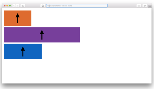
Example of natural document flow
Below is an example of a two <div> boxes, one inside another, with their default position:static;.
<div class="outerBox">
    <div class="innerBox">
    </div>
</div>
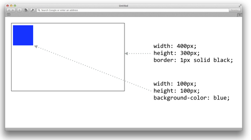
There is one <div> box inside another. They both stack from the top down, and justify to the left.
Example when the inner box is set to position:absolute
Below is an example when we set position:absolute on the inner box, and give it coordinates using top: and left:.
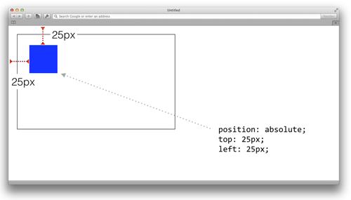
As we can see from the image above, it’s as if the inner box doesn’t respect the outer containing box. This is because of the rule for absolute boxes:
Absolute - Elements are positioned separate from the document flow. Items will be located relative to the first parent element that has any positioning other than static.
Example when the outer box is given position:relative
In this example below, we set the outer box to have position:relative. While there are no effects on the outer box itself (it will operate exactly like the default static) it does affect any elements inside the box to use it as a frame of reference.
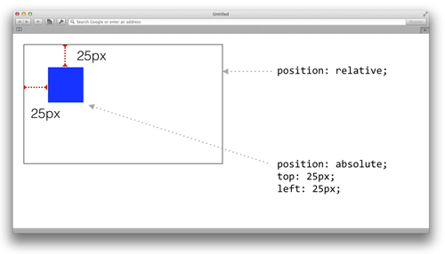
Relative is only used to affect elements inside this box. It doesn’t affect the box itself because of the rules of relative positioning.
Relative - This is identical to static, but causes elements inside this tag to use it as a frame of reference.
Example when both boxes are set to position:absolute
In this example, we can set both boxes to position:absolute. The inner box’s left and right coordinates are based on the outer box, just like in the previous example.
Position Fixed
Position fixed completely removes the element from the flow and bases its position on the viewport, not the document. This means an element will stay on the screen even when the user scrolls.
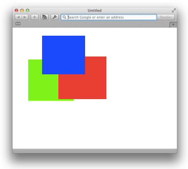
Z-index
Z-index determines the stacking order of elements that have a positioning property applied to them (other than static).
- A z-index property is an arbitrary number that determines the stacking order.
- A higher z-index number will indicate those elements should be on top. A lower number means they should appear underneath other elements.
- Z-index properties can only be applied to elements that are positioned with relative, absolute or fixed, but not the default static.
.redbox{
  position:absolute;
  top: 100px;
  left:300px;
  z-index: 20000;
}
.bluebox{
  position:absolute;
  top: 10px;
  left: 200px;
  z-index: 20001;
}
.greenbox{
  position:absolute;
  top:110px;
  left: 50px;
  z-index: 10;
}
Transforms
Transforms are a relatively new property in CSS. They allow you to adjust the position of an element based on its current position. So if you told it to go 10px to the left, it would move to the left based on where it currently sits. This makes it a useful tool in conjunction with positioning properties.
- Transforms are based on an element’s current position.
- Transforms are x value first (horizontal) and y value second (vertical)
div{
  transform: translate(10px,5px);
  transform: translateX(10px);
  transform: translateY(5px);
}
Other Transforms
You can also rotate, skew and scale elements with transforms. Just note, to apply multiple transform functions, you need to pair them up as a single value to the transform property.
div{
  transform: translateX(5px) rotate(9deg) scale(1.5);
}
More information about transforms are on the MDN website.
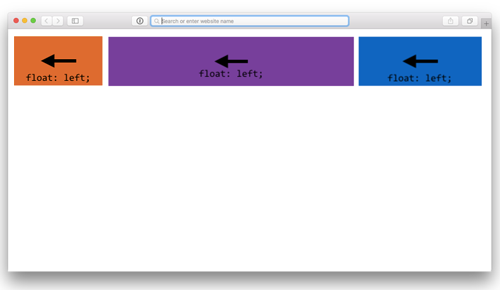
Floats
Floats are a way to change the stacking order of elements to either the left or right of the page.
Normal document flow is to stack from the top down. But by applying a float property, you can change this order.
.orangeBox{
  float: left;
}
.purpleBox{
  float: left;
}
.blueBox{
  float: left;
}
Text wrapping
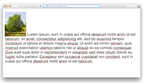
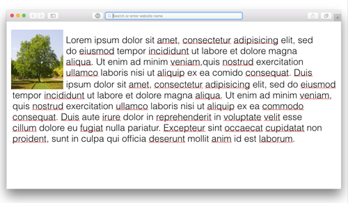
Another useful part of floats is when you apply them to images or blockquotes within text. This will cause the text to wrap around the element automatically.
Then, when a float:left; is added to the image, the text wraps around the image like so:
Clearing Floats
When you float an element, the container its in no longer sees it as content in some senses. Typically, an inner element will push open a containing box. But once the element is floated, the parent element will act as if it wasn’t there.
The solution to this is a simple hack called a clearfix. The clearfix is a snippet of CSS which places an invisible element inside the parent that pushes open the box, so it can “see” the floated element.
.clearfix,
.clearfix:after {
    content: " ";
display: table;
}

.clearfix:after {
    clear: both;
}
Then you would apply the clearfix class to the containers of floated elements.
Exercise on Positioning
You will be constructing the following image using CSS positioning properties.
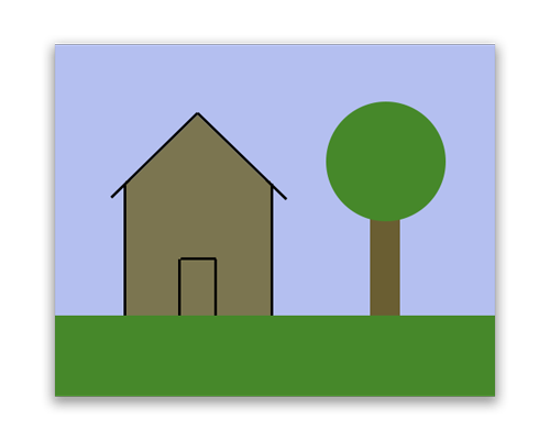
You can download the varies pieces from this .zip file.
Here is a starter template:
<!DOCTYPE html>
<html>
<head>
    <meta charset="utf-8">
    <title>Intro to Coding Interactives</title>
    <style>
        html, body, div, span, h1, h2, h3, h4, h5, h6, p, a, em, img, strong, b, u, i, ol, ul, li, form, label, legend, caption {margin: 0;padding: 0;border: 0;outline: 0;font-size: 100%;vertical-align: baseline;background: transparent;}

        .container{
            width: 500px;
            height: 400px;
            margin: 20px auto;
        }

        #sky{

        }

        #grass{

        }

        #tree-trunk{

        }

        #tree-top{

        }

        #house{

        }
    </style>
</head>
<body>

    <div class="container">
        <img src="grass.png" alt="grass" id="grass" />
        <img src="house.png" alt="house" id="house" />
        <img src="sky.png" alt="sky" id="sky" />
        <img src="tree-top.png" alt="tree top" id="tree-top" />
        <img src="tree-trunk.png" alt="tree trunk" id="tree-trunk" />
    </div>

</body>
</html>